SLA Nusra Case Study: A School Website Built for Slow Internet and Mobile Users
Case study of slanusra.sch.id: building a school website for limited connectivity—mobile-first, lightweight pages, and fast access on slow networks.
On this page
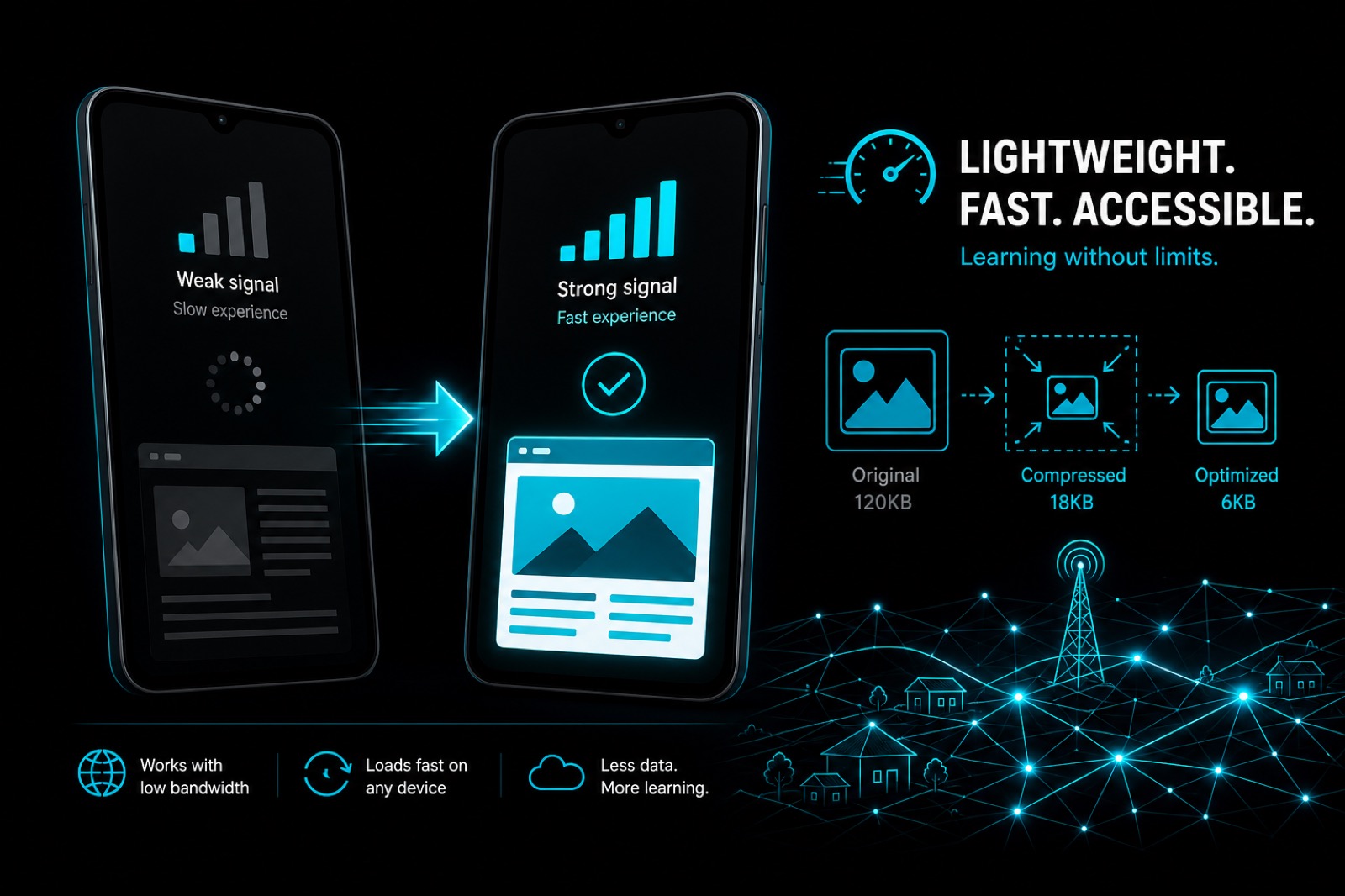
Not every school sits in a city with stable internet. In many regions, parents and students check information on phones with weak signal, limited data plans, or networks that rise and fall through the day.
The SLA Nusra project was shaped by that context from day one: a school website must still work when connectivity is poor. Not merely “look good on office Wi-Fi,” but remain openable, readable, and usable under imperfect network conditions.
This article covers the challenges, design/technical decisions, and solutions used to keep the official school site fast and accessible.
Client background
SLA Nusra needed an official website to:
- present academic profile and school programs;
- share information with the community;
- act as a credible communication channel;
- support school discovery through online search.
What made this project different from many urban school sites was the infrastructure context: uneven internet access, with most visits coming from mobile devices.
Core challenges
1. Slow and unstable connectivity
In low-bandwidth environments:
- large images quickly make pages feel stuck;
- too many scripts punish low-end phones;
- timeouts rise when the server responds slowly.
2. Primary users are phone users
Parents rarely sit at a laptop just to check announcements. They open the site while commuting, standing in line, or using fluctuating 3G/4G.
So the design had to be:
- readable on small screens;
- data-efficient;
- quick to reach critical content (contact, programs, news).
3. School content must stay complete without becoming heavy
Schools still need activity photos, profiles, and program information. The challenge: deliver enough richness without punishing users on slow connections.
4. Trust erodes faster on constrained networks
If a site is slow or fails to load, users in low-connectivity areas give up sooner than users on strong Wi-Fi. First impression matters even more.
Solution principle: design for a realistic worst case
The approach was not “optimize later,” but a performance budget from the start.
Working assumptions:
- mid-to-low-end phones;
- networks often below ideal conditions;
- critical content must appear first;
- every kilobyte needs a reason.
Solutions implemented
1. Concise, clear information architecture
Before animation or visual effects, page structure was designed so parents could quickly find:
- school profile;
- programs/academics;
- news/communication;
- contact.
Fewer wasted taps means less time and less data.
2. Mobile-first that is actually used
Mobile-first here meant real priorities:
- typography readable without excessive zoom;
- tappable CTAs;
- simple navigation;
- main content not blocked by decoration.
3. Bandwidth-aware media assets
School photos still matter, but they were managed tightly:
- compress images before publish;
- size assets to display needs;
- avoid oversized hero images;
- lazy-load below-the-fold media.
On slow networks, media strategy often beats CSS micro-optimizations.
4. Lean frontend with a controlled modern stack
SLA Nusra was delivered with a modern approach (PHP, Laravel, Inertia, JavaScript, CSS3) under discipline:
- cut unnecessary dependencies;
- keep JS payload controlled;
- preserve responsive key interactions;
- prioritize content rendering over visual effects.
5. Performance as a release requirement
Before calling the site done, it was evaluated from a mobile-user lens:
- do key pages feel readable quickly?
- does layout stay stable while loading?
- can any requests be deferred?
- are major PageSpeed categories healthy for a school context?
Measured results landed in a strong range for Accessibility and SEO, with competitive Performance for a content-driven school website.
6. Technical SEO so the school can still be found
Even with a slow-access focus, SEO was prepared:
- relevant titles/descriptions;
- structured headings;
- crawlable key pages;
- content that supports regional school search.
Because when users finally get online in limited-connectivity areas, they need the right information immediately.
Results
After delivery, SLA Nusra went live at slanusra.sch.id as an official site that is:
- better prepared for mobile access;
- more frugal on slow connections;
- still clear in presenting school information;
- built on strong SEO and accessibility foundations.
Portfolio details: /portfolio/slanusra/.
Checklist for schools in low-connectivity regions
If you are building a school website in a similar context:
- Treat phone + weak signal as the default, not an edge case.
- Limit image weight before go-live.
- Prioritize critical above-the-fold content.
- Cut plugins/libraries that do not directly help users.
- Test on throttled networks, not only office Wi-Fi.
- Re-measure after adding galleries or new posts.
Conclusion
The SLA Nusra case study shows that a good school website must empathize with real user conditions.
When internet is limited and access is mostly mobile, the best solution is not “add as many features as possible”—it is to simplify information paths, slim down assets, and keep speed as a product promise.
That is the approach behind slanusra.sch.id: building a school digital presence that remains reliable even when connectivity is far from ideal.